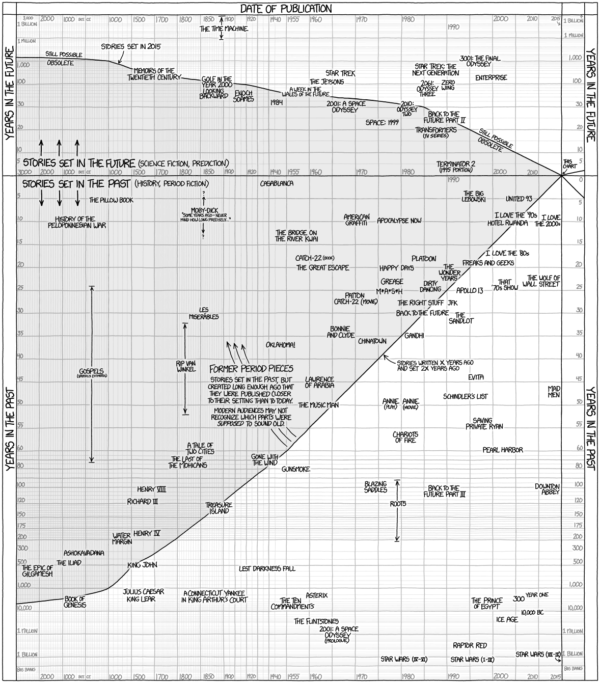
Posted March 8, 2015 | Original Source: xkcd.com
A cool chart by Randall Munroe at xkcd.com showing a graph of the relationship between when movies and TV shows were released and the era in which they are set. Click to enlarge.
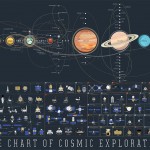
Charts about space, sci-fi, and other geeky things…
Posted March 8, 2015 | Original Source: xkcd.com
A cool chart by Randall Munroe at xkcd.com showing a graph of the relationship between when movies and TV shows were released and the era in which they are set. Click to enlarge.