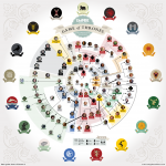
March 23, 2020 | Original Source: Visual Capitalist
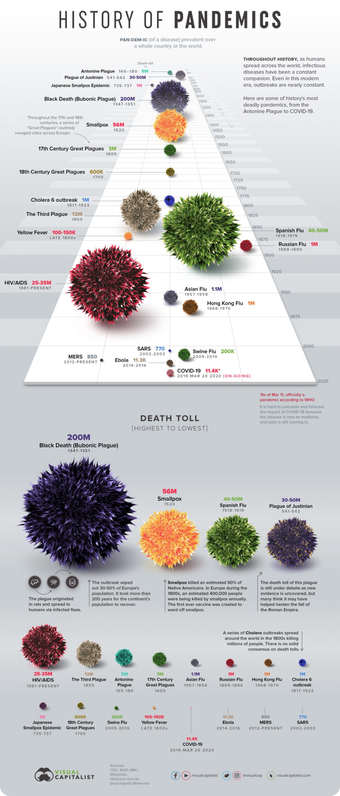
While this chart certainly won’t be current for long with COVID-19 on-going, it is an interesting visual depiction of the timeline and death toll of pandemics of the past. Click to enlarge.
Charts about space, sci-fi, and other geeky things…
March 23, 2020 | Original Source: Visual Capitalist
While this chart certainly won’t be current for long with COVID-19 on-going, it is an interesting visual depiction of the timeline and death toll of pandemics of the past. Click to enlarge.